

Scharf Inspections: Website Redesign
Improving customer experience for home inspection website.
UX Writing | UX/UI Design | Research
OVERVIEW
Client
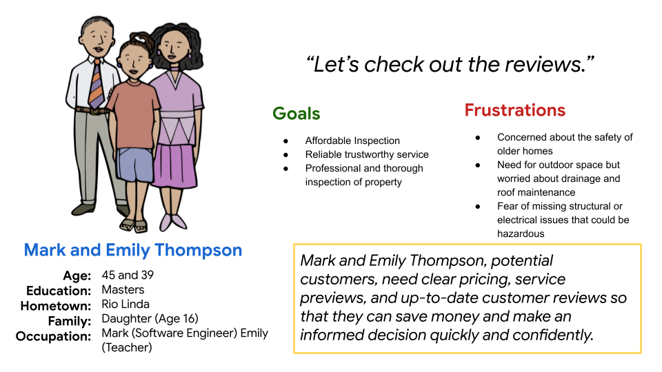
Scharf Inspections: Sacramento based home inspections service company
User
Real Estate Agents + Homebuyers
My Role
UX Design, UX Research, Content Design
Timeline
8 weeks (July, 2024 - December, 2024)
Tools
Figma · Figjam · Descript · Miro
Key Deliverables
Competitive Audit Report
Revised Desktop/Mobile Mockups
Improved Information Architecture
Problem
Lack of new customer home inspection bookings on client website.
Real estate agents and home buyers needed a quick way to find and understand key info to trust the service and book an inspection.
Solution
I re-designed the client's homepage to:
-
Balance agent and buyer needs
-
Highlight key selling points
-
Improve information architecture


Project Summary:
Scharf Inspections wanted to improve their website to better attract new customers and streamline booking for returning users. After conducting a content audit and usability testing, I identified key navigation issues, such as confusing labels and missing service area info. By reorganizing the sitemap and relabeling key sections, I helped increase the success rate of users finding their service area by 25%.
I also redesigned the homepage, focusing on user needs for trust and efficiency. I made key content like reviews, certifications, and booking options easy to find and adapted the design to emphasize benefits over pricing, based on client feedback and competitor analysis.
Outcome:
Reorganized confusing navigation, leading to a 25% increase in users finding their service area
Updated content to meet the needs of new and returning users
Unified the brand voice and design to boost credibility and trust
Designed a streamlined mobile homepage so key actions like booking, reviews, and contact were easy to access on the go
MY APPROACH
1
Research
-
Content Audit
-
Competitive Analysis
-
Desktop Research
-
User Interviews
-
Usability Testing
2
Design
-
Ideation
-
Sketching/Lo-fi Prototypes
-
User Feedback
-
Information Architecture
3
Evaluate
-
Usability Testing
-
Client Feedback
-
Site Build Testing

Initial audit
I kicked off the project with a content audit to get a clear picture of what was working—and what wasn’t—on the client’s website.
Through the audit, I discovered:
-
Language that was inconsistent or unclear
-
Info that felt irrelevant or confusing
-
Over 20 accessibility issues on every page
-
Broken links and incomplete navigation
To better understand the home inspection industry, and how Scharf Inspections could stand out, I also did a deep dive into top local competitors.
What stood out was how competitors use their content to show they’re professional, experienced, and trustworthy—all areas where the current Scharf website wasn't doing effectively.
The audit and competitive analysis made it clear: the homepage wasn’t communicating the trust signals new customers needed, like credibility, professionalism, and experience.
See my audit and competitor analysis here:

To audit for usability and accessibility, I used Nielsen Norman Group’s 10 Usability Heuristics and WAVE's accessibility tool.

I analyzed the content of Scharf's top two competitor's by first impression, website interaction, visual design, and content design.

I catalogued the business' current benefits as well as identified how the current copy addressed user needs.
To audit for usability and accessibility, I used Nielsen Norman Group’s 10 Usability Heuristics and WAVE's accessibility tool.
RESEARCH

See some work samples here:


User interviews
Now that I had identified trust as a key factor in attracting new customers, I interviewed Scharf Inspections’ core customers, real estate agents, to understand: what actually builds trust?
To my surprise, trust wasn’t their top priority. What they really cared about was speed—easy scheduling, regular updates, and frustration with poor communication came up again and again.
But it made sense: most of these agents had been working with Scharf for years. Trust was already a given.
So… what about new customers?
I asked a few people, who weren’t current Scharf customers, to complete tasks on both the Scharf site and a competitor’s. Unlike the real estate agents, these new users focused on trust and affordability. They looked for things like recent high reviews and clear, upfront pricing.
Key insight:
The content redesign needed to speak to two different user groups:
-
Returning users want speed and efficiency
-
New users want reassurance and transparency
Check out this story for more juicy details...
Story-time: Design Starts with Users—Even in Interviews It was surprisingly challenging to schedule user interviews with the real estate agents. My first strategy involved emailing and calling from a list of customers I had requested from Erich. This request included scheduling a 15-30-minute interview with the Calendly scheduling app. I thought that this would make things more convenient for them. It did not work. I had no responses for over a week. Finding willing interviewees was made doubly difficult because I did not have the budget to provide incentives to the interviewees. Upon reflection, I realized that I wasn’t being user-friendly with my interview scheduling. I should’ve considered that these real estate agents' lives were really busy and minimized the amount of effort required on their part to participate in an interview. I recalled some advice I received before, “Set the bar so low, they can’t help but cross over”. I switched my strategy to calling and asking for 5-minute interviews and adjusted my questions to allow for shorter answers while still staying true to my objectives, and instantly got better results.


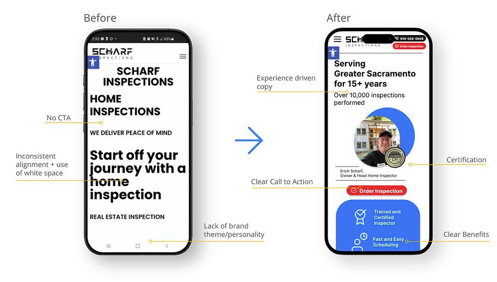
Homepage content design
I redesigned the homepage for both desktop and mobile through several rounds of collaboration with the client. My goal was to align with their branding and make the site work better for what users actually needed: efficiency and trust.
From user research, I learned that many people were looking for things that weren’t visible on the original homepage—like pricing, reviews, and proof of professionalism. Some even left the site to check Yelp or struggled to find basic info.
So I reorganized the content to make the decision easier and highlight what makes Scharf Inspections stand out.
To improve efficiency, I:
-
Made the “Book Inspection” button easy to find
-
Highlighted the phone number for quick contact
-
Called out the 24-hour turnaround on digital photo reports
To build trust, I:
-
Rewrote the headline to show the company’s experience
-
Displayed the inspector’s certification with a link to full credentials
-
Added recent Yelp reviews and ratings
I initially included a pricing box on the homepage based on user feedback, but the client was concerned it could turn people away. To validate, I reviewed 10 competitor websites and found that most didn’t display pricing up front. In response, I revised the design to highlight key benefits—like fast turnaround, reliability, and experience—helping build trust without deterring potential customers.
See the progression of the re-design here:


DESIGN

Examples of information architecture copy edits
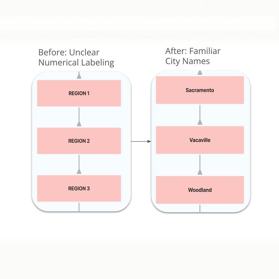

User research showed that the home menu label and region number menu labels were confusing.

Revised site map based on user feedback.
Improved information architecture
I'm a paragraph. Click here to add your own text and edit me. It’s easy. Just click “Edit Text” or double click me to add your own content and make changes to the font. Feel free to drag and drop me anywhere you like on your page. I’m a great place for you to tell a story and let your users know a little more about you.
During my usability tests, I found that 75% of the tested users found the navigation confusing.
Some issues included:
-
The"Area's Served" pages were labeled by region number, but most users were looking for city names.
-
The "Home" label in the main navigation bar included a sub-section for home services, which many users missed because they assumed it was the home button.
Over a week, I reorganized and relabeled the site map based on user feedback, re-tested the changes, and recommended updates to the client.
Impact:
-
25% increase in users successfully locating their service area
.
OUTCOME
Updated desktop homepage
Click and drag the slider line to see the transformation!
Updated mobile homepage
Scrollable homepage
Summary of impact:
Reorganized confusing navigation, leading to a 25% increase in users finding their service area
Updated content to meet the needs of new and returning users
Unified the brand voice and design to boost credibility and trust
Designed a streamlined mobile homepage so key actions like booking, reviews, and contact were easy to access on the go
Testing final design
After getting client approval on my redesigned landing pages, I re-tested them with early users. They found the new content easier to navigate, said it answered their most pressing questions, and several noted that they appreciated the modern, clean look.
Since completing the redesign, I’ve shared the finalized versions with the client and am currently (as of April 2025) building them out on the client’s WordPress site.
Next steps
-
Build out the rest of the booking inspection flow prototype
-
Apply the updated design and branding across the rest of the website
-
Conduct additional usability tests with both existing and new customers
-
Measure whether the content changes increased users' efficiency in finding key information
Post-implementation
-
Use Google Analytics to measure the impact of the redesign by comparing the percentage of new customer bookings before and after launch
TAKEAWAYS
What I learned:
Learn by doing
As my first content design role, this project was full of firsts. I learned how to conduct user research, apply Nielsen Norman’s usability heuristics to audit a website, work with Figma and WordPress, and present my design decisions effectively to stakeholders, especially the business owner, who had no UX background. I also learned how to turn user feedback into actionable design improvements.
The internet is full of valuable resources; use them!
Through trial and error, I came to appreciate the value of these processes in creating quality content. I also discovered the importance of checking my work against industry standards. Studying more experienced content designers online gave me the confidence to trust my research-based decisions and keep improving.
Biggest challenges:
Lack of UX research and stakeholder trust
The client hadn’t done any UX research and was unfamiliar with design best practices. Even when I presented research-backed recommendations, he needed more evidence to feel confident, especially since the business was his sole livelihood. Every design choice required extra care, clear rationale, and advocacy.
Wearing many hats
With no budget for additional team members, I took on research, writing, UX design, and product strategy. I also taught myself how to use WordPress to help implement the redesign. This gave me a hands-on crash course in the full product development process.
New industry, tight resources
Home inspection was a new field for me, so I had to quickly understand the business model, customer mindset, and what success looked like for the client. On top of that, the project had no funding, so I got creative with free tools and lightweight user testing to move the work forward.
What I'd do differently next time:
Client communication
Next time, I’d check in with the client more regularly throughout the project. Early on, I wasn’t sure how often to update him, but in hindsight, I could’ve clarified expectations in our kickoff meeting to avoid misalignment later on.
Feasibility check
I’d also double-check the feasibility of my design suggestions with the limitations of the client’s website platform to ensure smoother implementation.
Time management
And finally, I’d plan for more time at the end—both to refine the work and to wrap up with a stronger handoff or retrospective.
Thank you for reading my case study!
If you'd like to learn more about this project, feel free to contact me.
Or, check out more case studies below.
Prev Project
Next Project